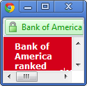
I was doing some online banking today at Bank of America (yes, I still have an account with them … for now). I saw a little announcement on the bottom left of the screen that said “Bank of America ranked #1 Online Bank.”
“Hmmmf,” I sniggered. I have experience with 3-4 online banking systems, and BOA is my least favorite in terms of ease-of-use and understanding-where-all-these-other-charges-are-coming-from. It has even been difficult to simply find out how much I owe and pay it. One of my old accounts is still listed in my payment center (even though I closed it over two years ago) and I can never remember which one is the active one.
I hardly ever read these sorts of announcements, but I wanted to see this one. I clicked on the link and the window that popped up was so tiny I laughed.
 Fortunately, Chrome lets you resize windows like this (IE doesn’t always). The article was just one sentence:
| This marks the 5th consecutive win for Bank of America according to the Q2 2011 Keynote Banker Scorecard, which rates the banking websites of 23 leading consumer banks. Bank of America ranks #1 against a set of more than 300 best practice criteria, including Privacy & Security and Ease of Use. |
Best online bank? Ease of Use? Then fix this! (Windows 7 Starter, SP1, on Chrome 15.0.)
Now, back to paying my bill …